The importance of color psychology in branding
I see you. You’re a business owner and a creative but when it comes to branding all you know is you need a logo, some pretty colors, a font or two, and BAM! Branding.
You may have browsed Pinterest for an hour or two and saw some pretty color combos that felt nice to look at and suited the colors you generally enjoy and so you went with it. And just like that the colors were set and no more thought was given to it.
Listen, I get it. And before I started studying brand psychology and strategy I pretty much was in the same boat as you. But I have some good news. Today is the day that you can take your color palette to the next level by learning how your colors can actually attract your target audience through psychology principes and work with your branding to grow your business instead of just looking pretty but staying ineffective.
Sounds exciting right? Well let’s get into it!
I see you. You’re a business owner and a creative but when it comes to branding all you know is you need a logo, some pretty colors, a font or two, and BAM! Branding.
You may have browsed Pinterest for an hour or two and saw some pretty color combos that felt nice to look at and suited the colors you generally enjoy and so you went with it. And just like that the colors were set and no more thought was given to it.
Listen, I get it. And before I started studying brand psychology and strategy I pretty much was in the same boat as you. But I have some good news. Today is the day that you can take your color palette to the next level by learning how your colors can actually attract your target audience through psychology principes and work with your branding to grow your business instead of just looking pretty but staying ineffective.
Sounds exciting right? Well let’s get into it!
COLOR ASSOCIATIONS:
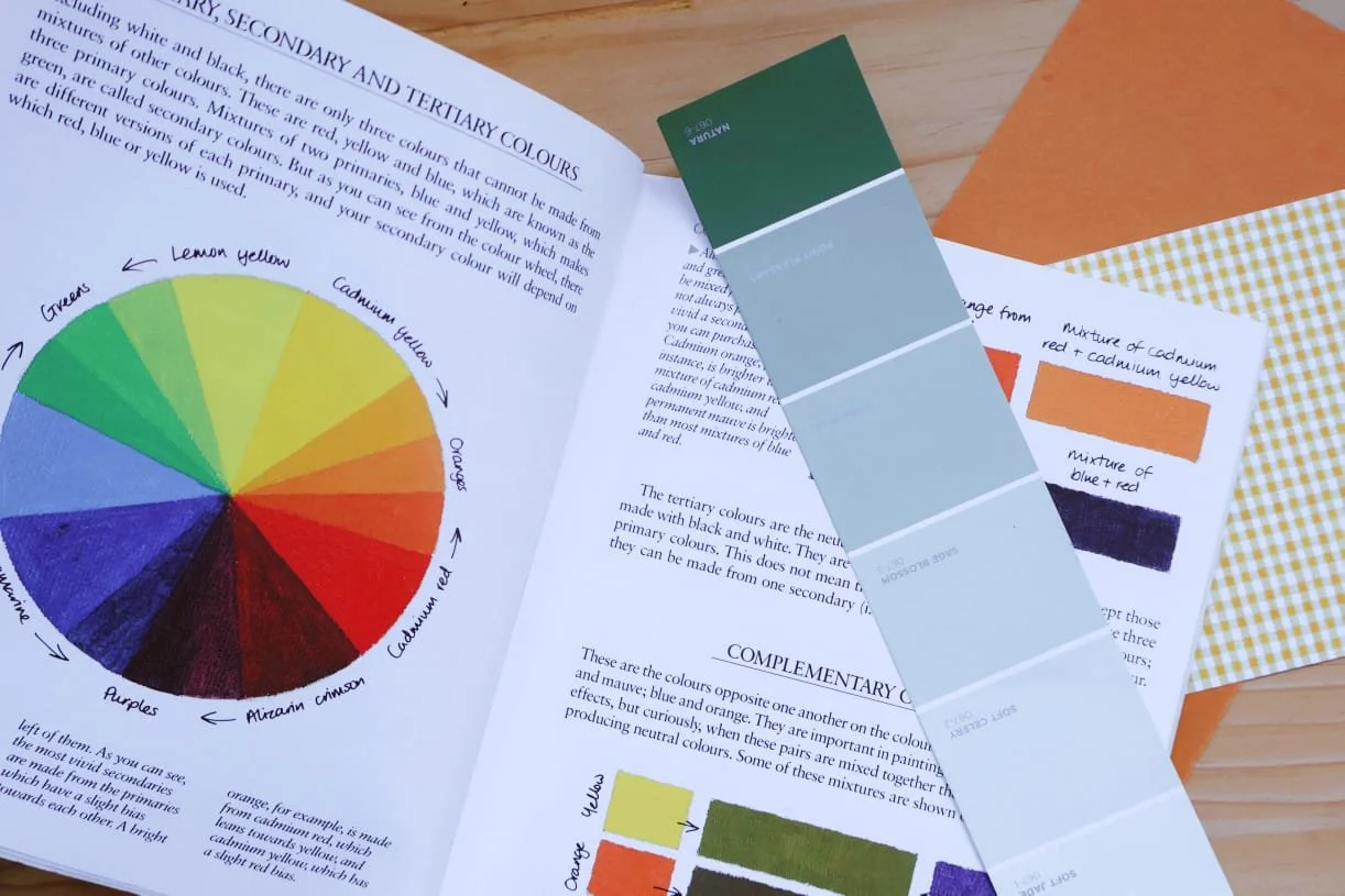
Firstly, it’s essential to understand how certain colors influence perception of a certain place, business or product. When it comes to color, as a society we have allocated certain meanings and feelings to the various colors without even being aware of it. For example, white makes us think of weddings, green makes us think of nature, red makes us think of danger or romance depending on the shade, and yellow makes us think of joy or the big M of McDonalds standing out during rush hour traffic when your stomach is growling.
These associations with color is what influences how we think and feel about certain businesses as well as the value we assign in our minds to the service they offer or product they sell. Just for an example, if you notice, most hospitals use blue for staff uniforms, bedding, etc. It makes you feel calm and safe, and subconsciously you feel like you can rest in a time when you’re vulnerable. Now imagine for a moment that all the bedding was neon orange and the walls were various shades of pink with a nurse hovering around in a bright green uniform? Can you feel the anxiety rising just thinking about it? Nothing about the building or the service they offer changed, but your perception of the experience shifted dramatically. That’s the power of color psychology at work. Pretty cool huh?
So let’s break it down color by color to see how you can use these principles to positively impact your business growth.
SHADES OF BLUE:
Blue is one of the most universally used colors because it is easy to use a large amount in a design or space without it feeling overwhelming. This is because blue denotes feelings of stability, trust, reliability and gives a strong sense of calm. For this reason, it is a common color to see used in the medical industry as well as in banks and investment companies. It is also a good color for self-care brands, clothing brands, and health food brands that focus on producing non-allergenic/organic products as it gives a sense of trustworthiness and high quality.
SHADES OF GREEN:
Similar to the blues, shades of green also denote feelings of trust and give a calm impression. Greens also have a strong association with nature and as such also are connotative with growth and sustainability. You will also see this color used frequently in the medical industry, financial industry, as well as the sustainable fashion, natural beauty, and organic food industries. It is also a top choice for florists and flower farmers as it connects well with the nature element of their work and, when using the right shades, can communicate an elevated and quality experience and service.
PURPLE AND PINK:
These colors are similar and yet very different too. Purple combines the calmness of blue with the energy of pink to create a color that communicates sophistication and even royalty. You see purple used often in the hospitality industry as it carries a certain element of luxury in it’s influence.
Pink, on the other hand, has a lot more energy and vibrancy which can make it harder to use without it becoming overwhelming. It is a good color to use as an accent to draw attention and make a statement. It tends to have strong associations to the feminist movement which can be a strength and a weakness, so use this color wisely if you decide to go for it. Lighter shades can be a lot more versatile than the bolder and darker shades, making it a little easier to use.
RED, ORANGE, & YELLOW:
All three of these colors carry feeling of excitement, passion, joy, and enthusiasm. As such they should be used wisely and generally not in large amount as they can easily overwhelm.
Red links strongly to passion and romance and as such is a good color to use in darker shades if that’s a feeling you’d want to communicate. Interestingly, it can also invoke feeling of hunger and so you see it used frequently in food and restaurant industries.
Oranges are a brilliant color to use to give a sense of excitement, joy, and enthusiasm. In darker shades, like a burnt orange, it can tie in a more grounded, sophisticated, and earthly feeling and combine it with a sense of excitement to produce a beautifully balanced color that can be used across multiple industries.
Yellow is one of the least used colors in design purely because it is easily overwhelming and can produce feeling of anxiety due to it’s association with caution signs etc. When used in a pastel shade however, it can be a beautiful accent in a color palette to add a pop of cheerful joy.
HOW TO APPLY COLOR IN YOUR BRANDING:
Now that you’ve gained some knowledge on color psychology and the principles that influence our associations to certain businesses, industries, and products, it’s time to see how it applies to your current brand palette.
Take a moment to sit back and evaluate your chosen colors in your branding. Do they feel aligned with the personality you are trying to build in your business and messaging?
If it helps, try to think of 4-5 key words that would describe your business. For example, if I think of Fifth Season (our branding & design studio), I would describe it as elevated, exciting, nature loving, empowering & caring.
For this reason we chose an olive green as our primary color (trustworthy, nature inspired, elevated growth)
Burnt orange as our secondary color (excitement in our rebrand process, empowering and bold)
A soft, dusty pink for our accent color (gentle & caring, passionate)
And then a nice off white to tie it all together!
CONCLUSION:
So now you are ready to tailor those brand colors of yours to fit your business like a glove and start to draw the right attention to your beautiful one-of-a-kind offer that you and only YOU can give to the world!
I hope this little exploration of color has blessed you and if you are still feeling a little lost when it comes to your target audience and how to get the right eyes on your work then be sure to pop on over to our contact form and drop us a message. We would love to see how we can work with you to create a brand identity that empowers your business to prosper beyond basic and grow into your vision!